MA Illustration Degree
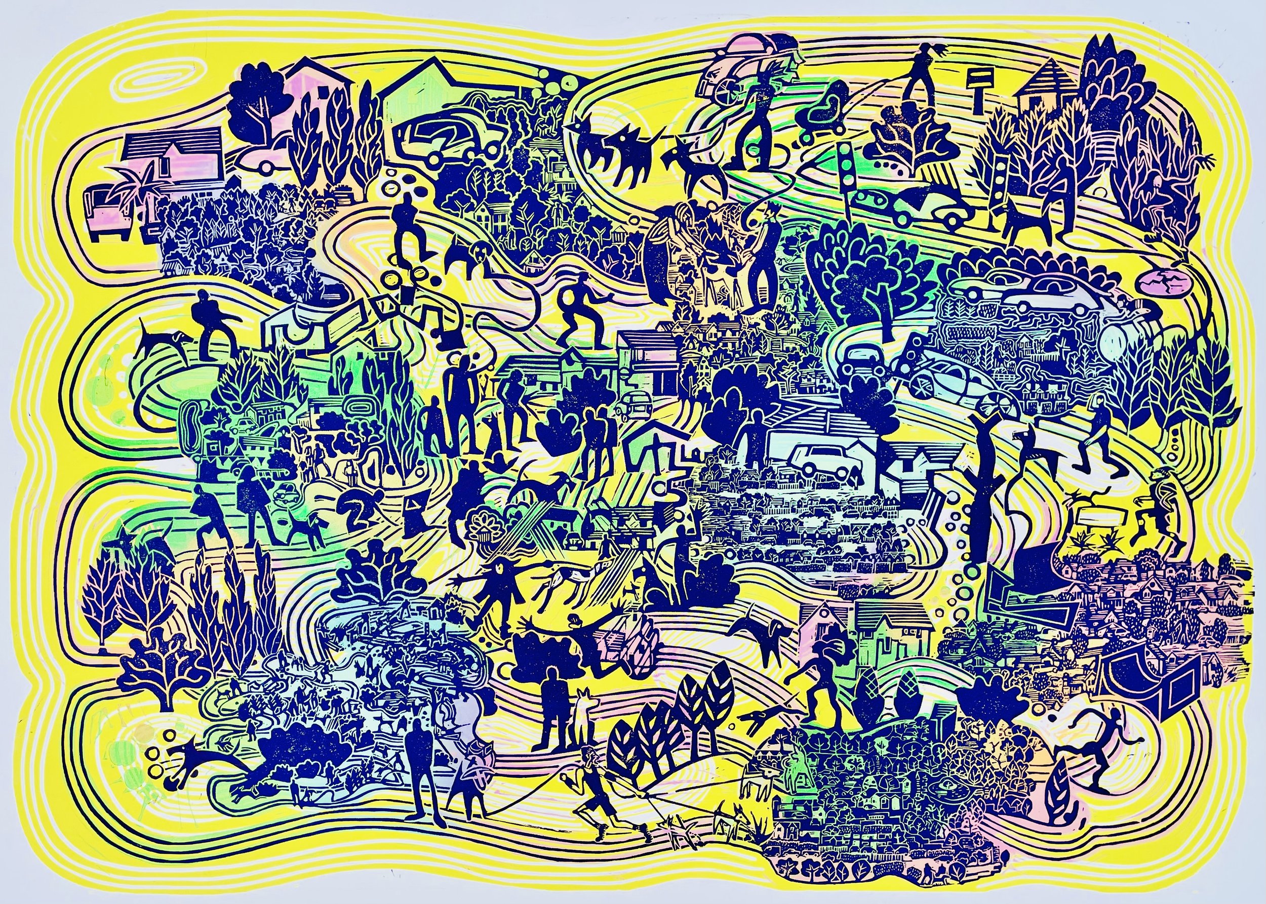
Hounds of the Heath 4. Linocut in three blocks with local colour added freehand on the second block. 76 × 56 cm 2024
I embarked on an MA Illustration Degree course part time at the University of Portsmouth in September 2022 and have now completed it. with Distinction. It has been a fantastic experience that certainly challenged me to understand new concepts, philosophies, ways of seeing and producing. A practice based course, students meet once a week to attend tutorials, seminars, presentations and workshops. We accessed the extensive facilities and staff expertise during the rest of the week. During the two years, I constantly reviewed and refined, my research, project proposal, illustration in context and major project modules.
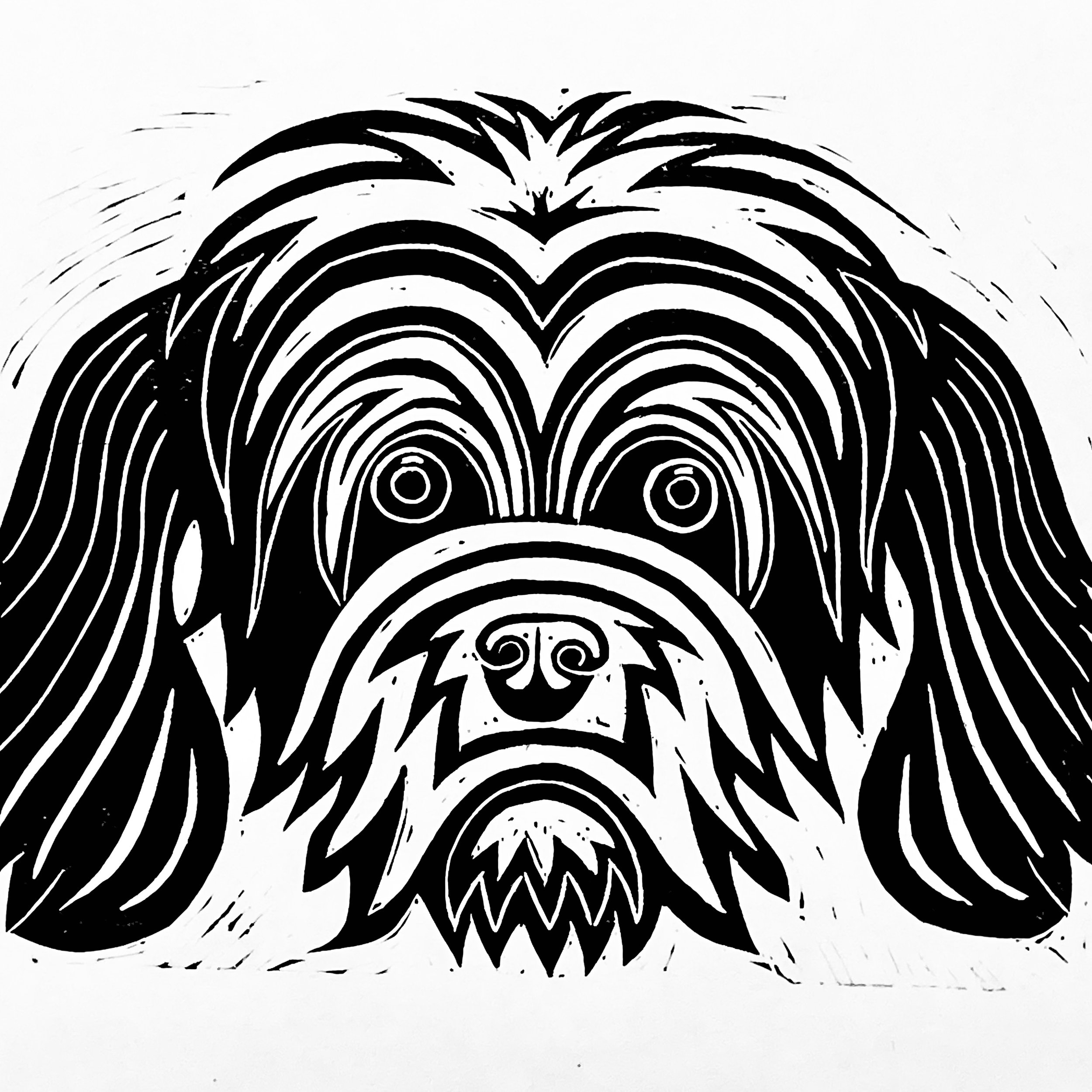
The linocut print Hounds of the Heath 4 is the latest piece in a series inspired by dog walking and Ordnance Survey maps, the print marked a culmination of the MA course and combines scaled down versions of previous prints with larger images of characters and incidents witnessed.
Hounds of the Heath 4 detail.
Hound of the Heath 4 detail
My MA Illustration proposal stated that I would make a series of twelve hand made prints on the theme of human canine companionship and connection. These linocut prints are published on my website.
The Grosvenor School
Claude Flight Speed c.1922
4 blocks edition of 50. 22.6 x 28.8 cm
Off white Japanese paper. 1st layer Yellow ochre. 2nd Cobalt blue. 3rd Vermilion. 4th Prussian blue.
I have been influenced by the work of the Grosvenor School artists. In particular, their simplification and stylisation when recording movement in everyday scenes and the limited use of three or four overlapping colours to create additional hues.
This print is unusual because it’s printed on the reverse side and Flight would often mount prints on yellow inked paper backing and sometimes dark toned paper, to modulate the image tonally.
A print by its handmade method of production can have 'patches of bald areas' and modulation of intensity and tone can be achieved with hand burnishing.
Claude Flight taught linocut at the Grosvenor School of Modern Art from 1926 - 30 and his methods were a big influence on his students. Most of the Grosvenor School linocut printmakers used three or four blocks, rarely reduction printing. Renowned for their application of movement and vibrant colours, they responded to Futurist Marinetti's call for art to reflect modern (1920’s) society, in a very direct way. They favoured using thin (tissue) Japanese papers which are robust.
Flight often did not date his prints, because artists would print in batches depending on popularity, in a print on demand arrangement. The Futurists used multiple viewpoints and interpenetrating planes to convey busy movement. Flight used curvilinear distortion and cropped images to suggest movement.
Cyril E Power The Sunshine Roof. c 1934 Linocut
4 block: 1. Cream, 2. Orange, 3. Mid green, 4. Dark green in that order.
Linocut has been seen as a rather lowly crude and simplistic art form, exploited by the German Expressionists: Erich Heckel and Christian Rohlfs. In the UK Horace Brodzky and Gaudier Brzeska, (Wrestlers 1914). But for Claude Flight it was a 'modern medium for a modern age,' linocut was expressive of the 'speed and dynamism' advocated by the Italian Futurists.
Cyril E Power, Folk Dance Linocut 1932
22 x 24.6 cm
4 block: 1. Peach, 2. Red, 3. Dark grey, 4. Black. On off-white Japanese paper.
The print does not contain solid blocks of opaque colour, there are subtle colour patches where previous colour layers show through top layers. Transparency can be achieved by adding extender.
Flight instructed to use equal amounts of detail on each block and to ignore the old guideline of the first block being a dark outline with subsequent layers being the colour infills.
Key exponents of linocut were: Sybil Andrews, Dorrit Black, Ethel Spowers, Claude Flight, Cyril Power, Lill Tschudi, Edith Lawrence. There were lots of other students who achieved recognition from Claude Flights teaching.
Sybil Andrews, The Winch, 1930
3 blocks 1. Chinese Orange. 2. Veridian. 3 Dk Blue
18.4 x 28.4 cm Edition of 50.
Most of the Grosvenor School printmakers made editions of 50 or 60 but printed them in batches on demand. What is evident from these examples is that the ink was transparent, to create addtional colours and tones where overlap occurs. Extender medium is added to the colour ink to create transparency, I add wax driers to speed the drying process, and will impatiently print wet on wet to see the outcome quickly.
As I have become more familiar with the process of making linocut prints I have adopted Claude Flights print on demand approach to producing editions. I publish test pieces online to establish whether they are worth editioning and then depending on popularity produce batches of up to 10, for an edition of 30 to 100.
Bibliography
Carey F. & Griffiths A. Avant-Garde British Printmaking 1914 - 1960 BMP 1990
Leaper H. Sybil Andrews and the Grosvenor School Linocuts. Osborne Samuel 2015
Ackley C. S. British Prints from the Machine Age. Rhythms of Modern Life 1914 - 1939. Thames and Hudson 2008
Etching process
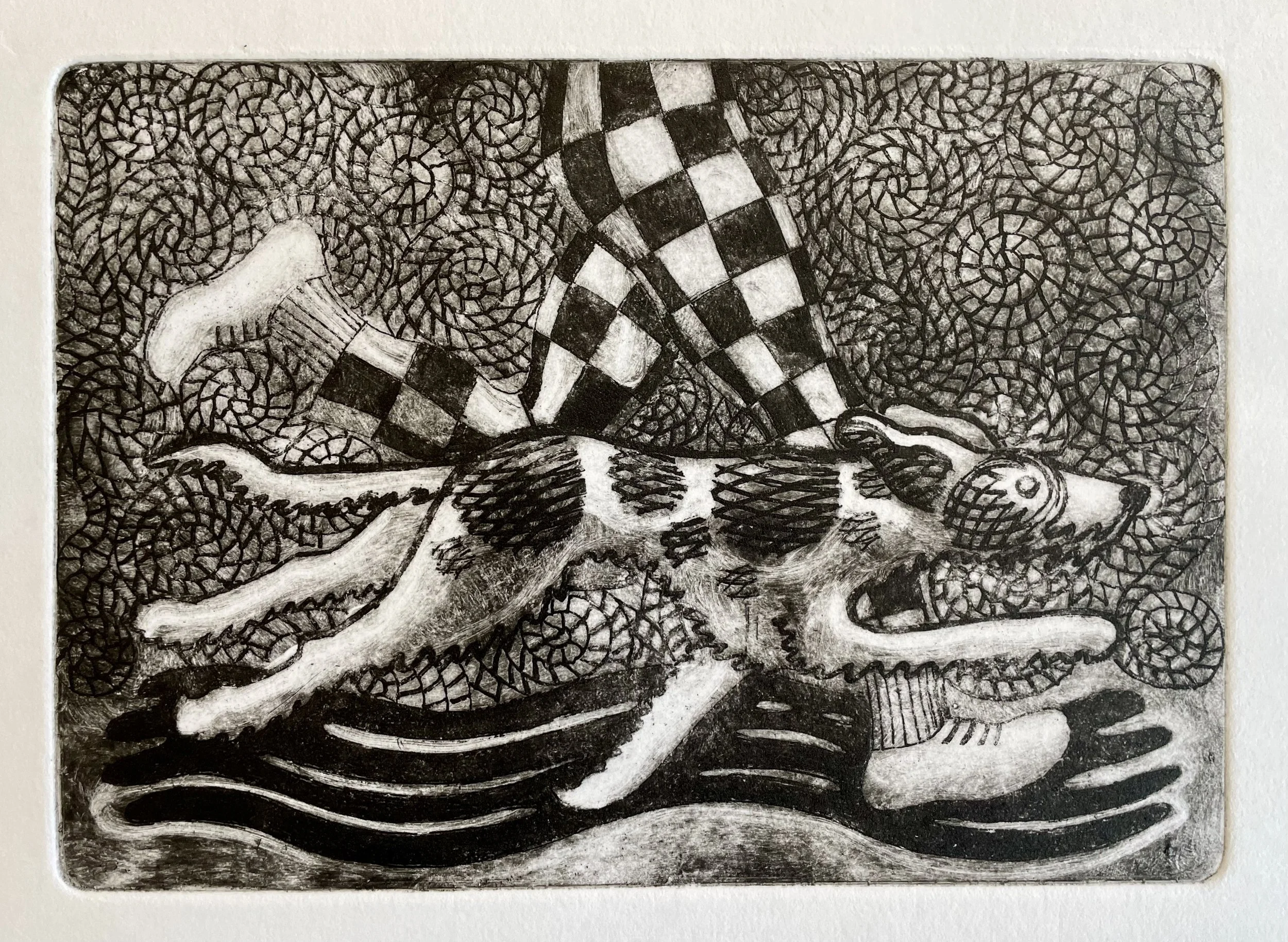
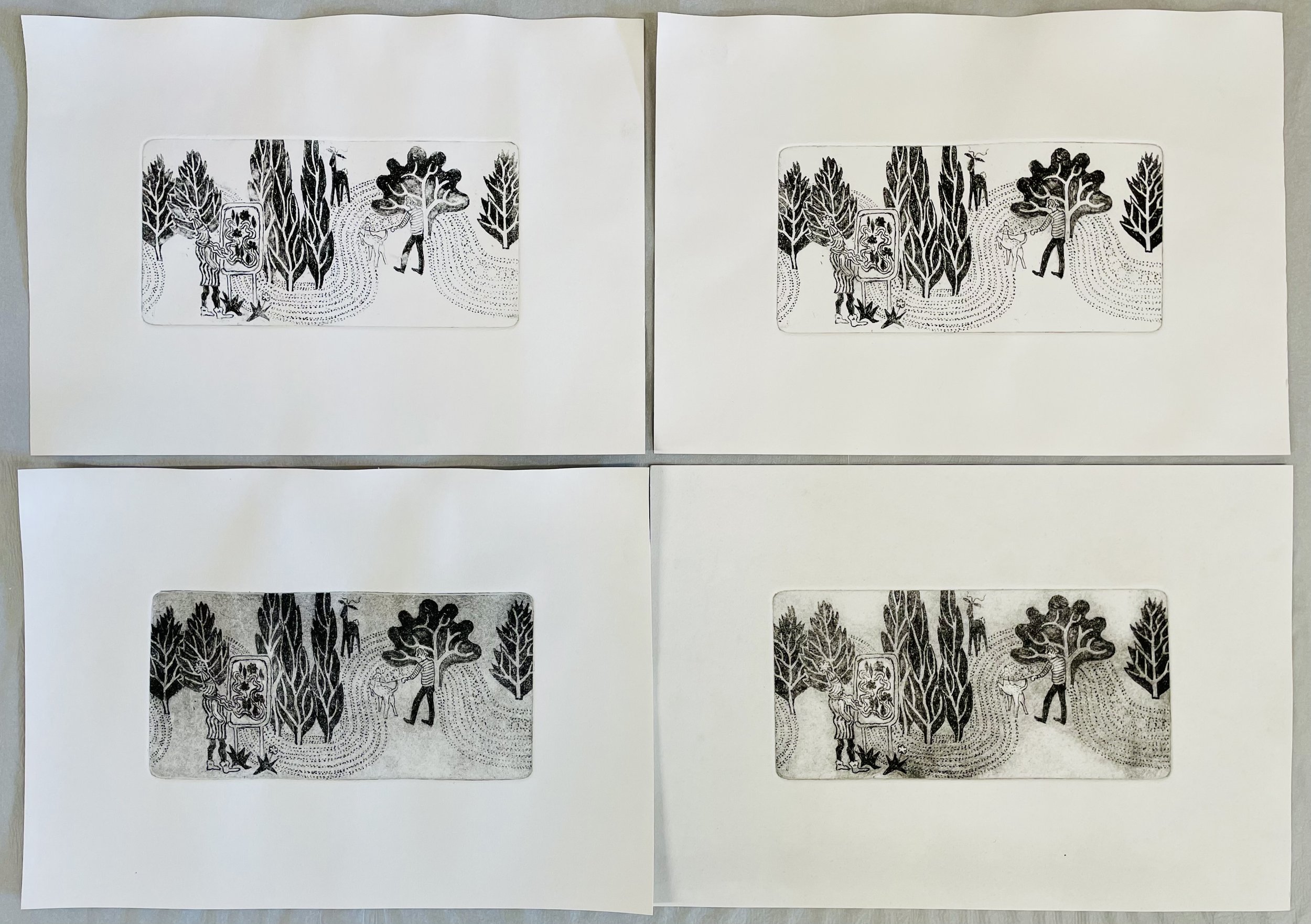
Wake Up Call. Etching 21 x 29.7 cm Mark H Jones 2024
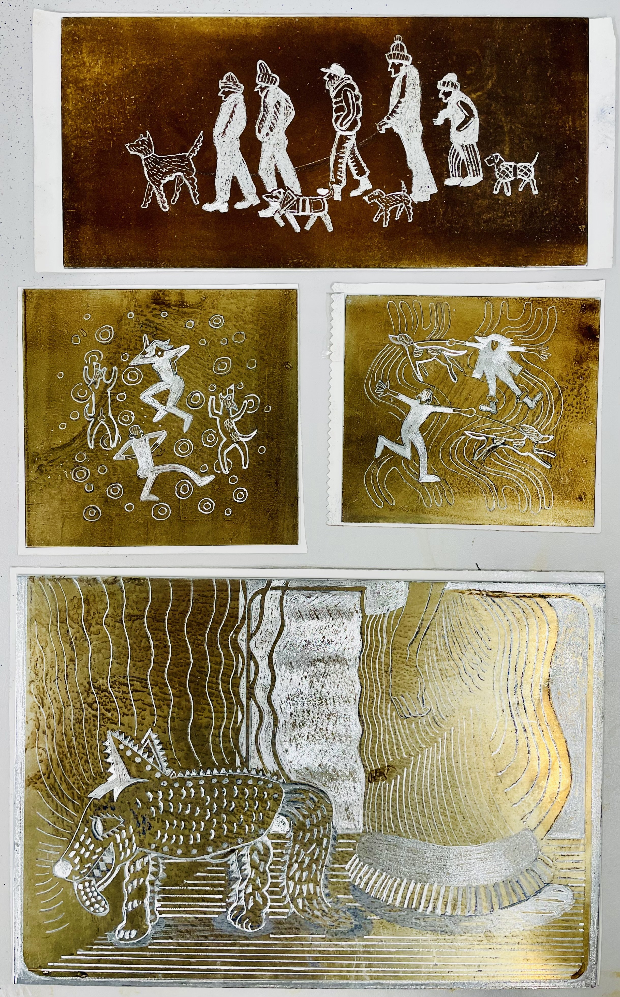
The proposal for my MA Degree major project included experimenting with etching using hard and soft grounds, a process perhaps sympathetic to my drawing style. Jordan Baines instructed me on the etching process which involves preparing a zinc plate by degreasing and applying a hard ground to the surface. Using a scribe or in my case a ‘dremel’ I drew through the ground. Once the scribing is complete, the back of the plate is covered with a sticky film to protect it. The plate is submerged in mild acid for between five to twenty minutes; the acid attacks the bare metal to leave a groove. The plate is rinsed and then cleaned with Lincoln wash, the sticky backing film removed and the edges of the metal plate chamfered with a file and burnisher. The etched metal is warmed on a hot plate and intaglio ink spread around the metal sheet with a card. Wiping back is a crucial skill ensuring sufficient surface ink is removed whilst enough is left to provide varied tone or chiaroscuro, this takes a lot of practice. Meanwhile the paper (Cartridge, Tracing, Kent or ‘bread and butter) is soaked for at least ten minutes, drained off and dried between blotting paper.
Lines drawn using a ‘dremel’ into hard ground. (Mark H Jones 2024)
Hard ground on a zinc plate in the acid bath. (Mark H Jones 2024)
Etched plate cleaned with Lincoln wash and chamfered. (Mark H Jones 2024)
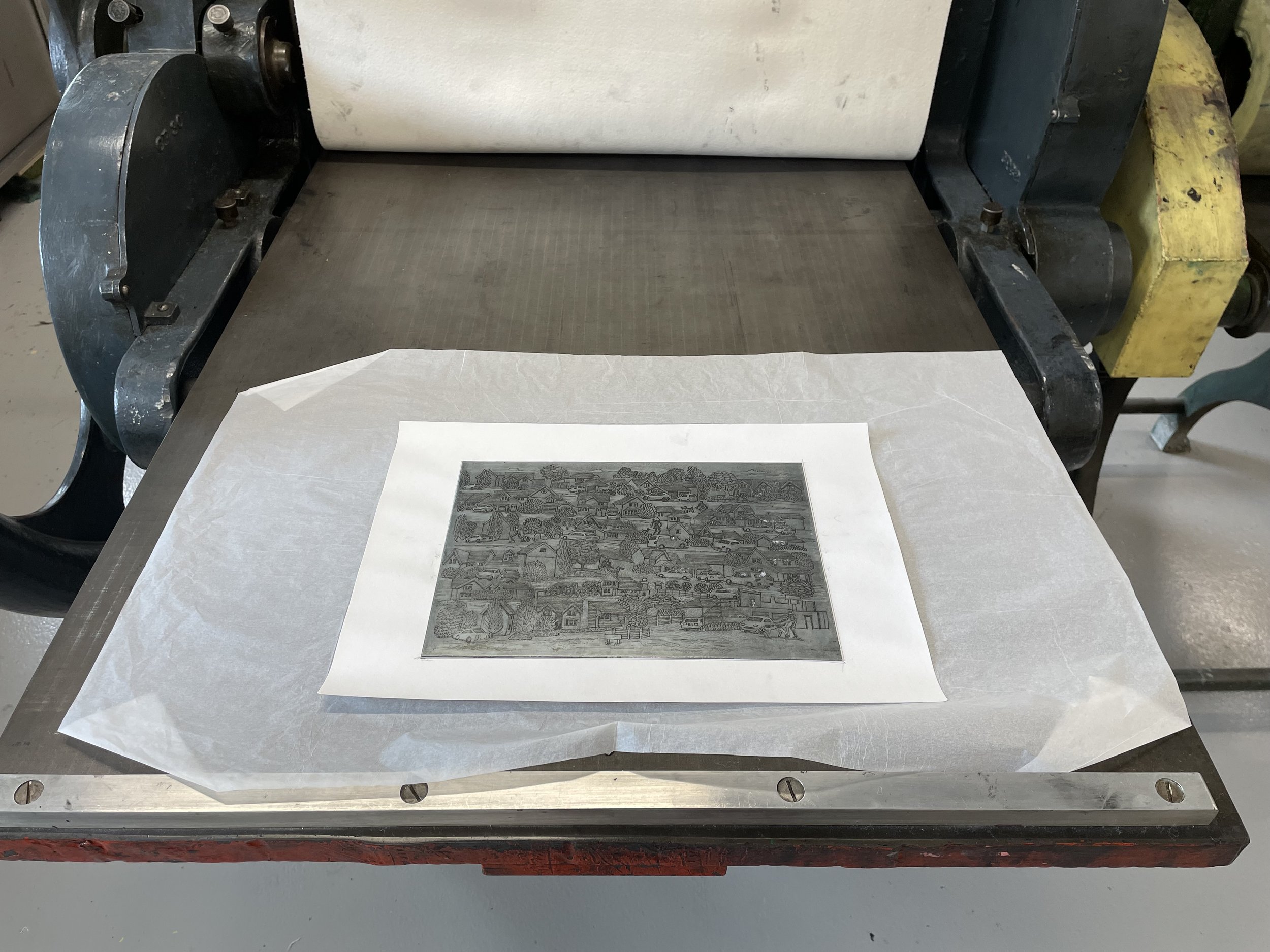
Printing with an Etching Press UoP Printmaking. (Mark Howard Jones 2024)
Inked etching plate on etching press bed before the damp paper is placed on top with another a layer of tissue pape addedr to protect the blanket. (Mark H Jones 2024)
Attempts to ink the plate and wipe back, in some cases overdone. (Mark H Jones 2024)
The damp paper draws the ink out of the etched lines when compressed in an etching press.
To get a decent print, the paper should be damp, I was blotting and drying it too much, and that meant the paper stuck to the plate. I also removed too much ink until I realised much could be done modulating the tone by selectively wiping areas of ink away, this is known as 'plate tone'. Some of my designs have relied purely on line and lack tonal variation, so when creating an image to etch it is useful to know how the process works, I have been doing this by trial and error and now appreciate how skillful etching is.
Let Loose. Etching 15 × 21 cm Mark H Jones 2024
I continue to call upon Jordan’s expertise and he has recently reviewed my efforts, providing suggestions on how to improve, I list my practical experiments regularly on social media: https://www.instagram.com/mark.jones.art/reels/
Park Map 7.5 × 15 cm Etching Mark H Jones 2024
Ros Simms gave tutorial feedback on my portfolio of etchings and explained how best to register multiple plates, along with the importance of using tissue paper to clean the plate without dislodging the ink where needed. She showed me fantastic examples of etching and mezzotint and I realise my efforts fell way short, I think I could have saved time and effort by asking for more direct instruction. The etching process has been fascinating and frustrating in equal measure. I look forward to persevering with this fascinating process.
Winchester Christmas Print Fair 2024
I really enjoy participating in the Winchester Print Fair, it’s a great opportunity to catch up with fellow printmakers and the atmosphere is always buzzing. I like to plan the display beforehand and treat it as a giant collage exercise. I’ve made a tall lightweight stand, that catches the eye from a distance and maximises the table top space. For my seventh print fair, I’ve produced some new themes; ‘companionship’ and ‘tasty morsels’, to add to the existing ‘landscape/maps’. I note conversations with stallholders, visitors and customers, it helps to review the display and record ideas for new work. In terms of the display design I have always composed in rows, but next time the format will be totem pole columns. I feel a visit to either Pitt Rivers or the British Museum coming on. New ideas include producing colour versions of recent work and having a display solely of colour prints..
The Morning Walk video
The Morning Walk
I spend so much time walking with my dog 'Bruce', so I decided to film our morning walk from his perspective, using a 'GoPro' video camera attached to his harness. The titles refer to invented names for parts of our suburban, some are self explanatory others more obscure: the Avenue; a line of elm trees, Crabapple mash; a tree whose apples get trodden on, The Judd; a severely trimmed hip high square hedge - reminiscent of a Donald Judd Minimalist sculpture. By naming these ordinary non descript features the walk takes on more significance, our dog is eight years old and we have walked this route most mornings - so its a well trodden path, which I can easily visualise in my mind. Because Bruce will often stop, I am forced to slow down and notice and appreciate our surroundings and I usually feel calm and relaxed during our stroll. Occassionally there are incidents, sparked by Bruce's reaction to squirrels, deer and some other dogs when the tranquil mood is disturbed as he pulls on the lead, I dare not let him off because he loves to chase. The walk last for twenty minutes but its been edited down to three to capture the gist of it.
Society of Graphic Fine Art 2024
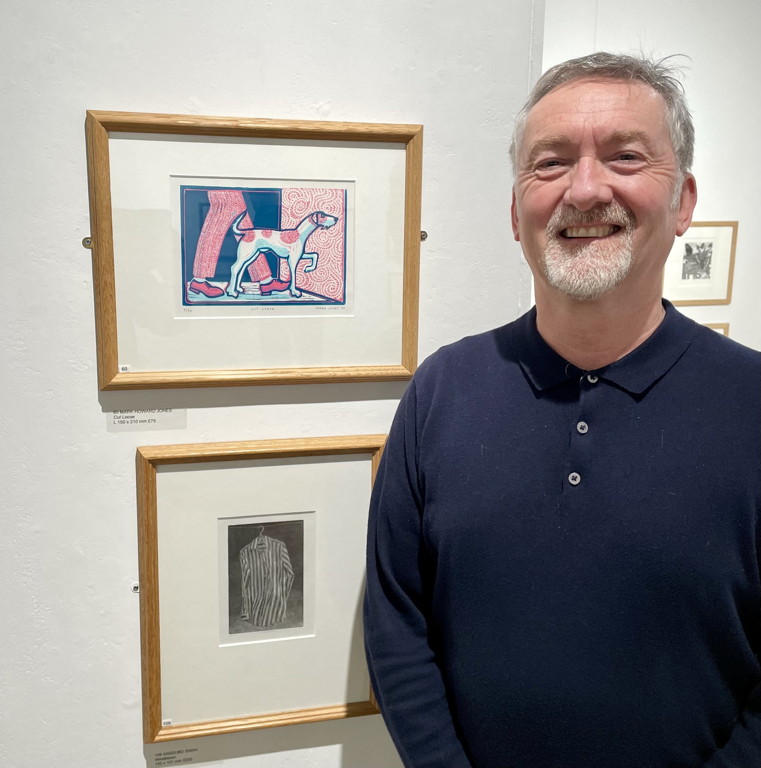
Delighted that the Cut Loose linocut print was accepted at the Society of Graphic Fine Arts 2024 show organised by The Drawing Society at the Mall Galleries.
Artwork description:
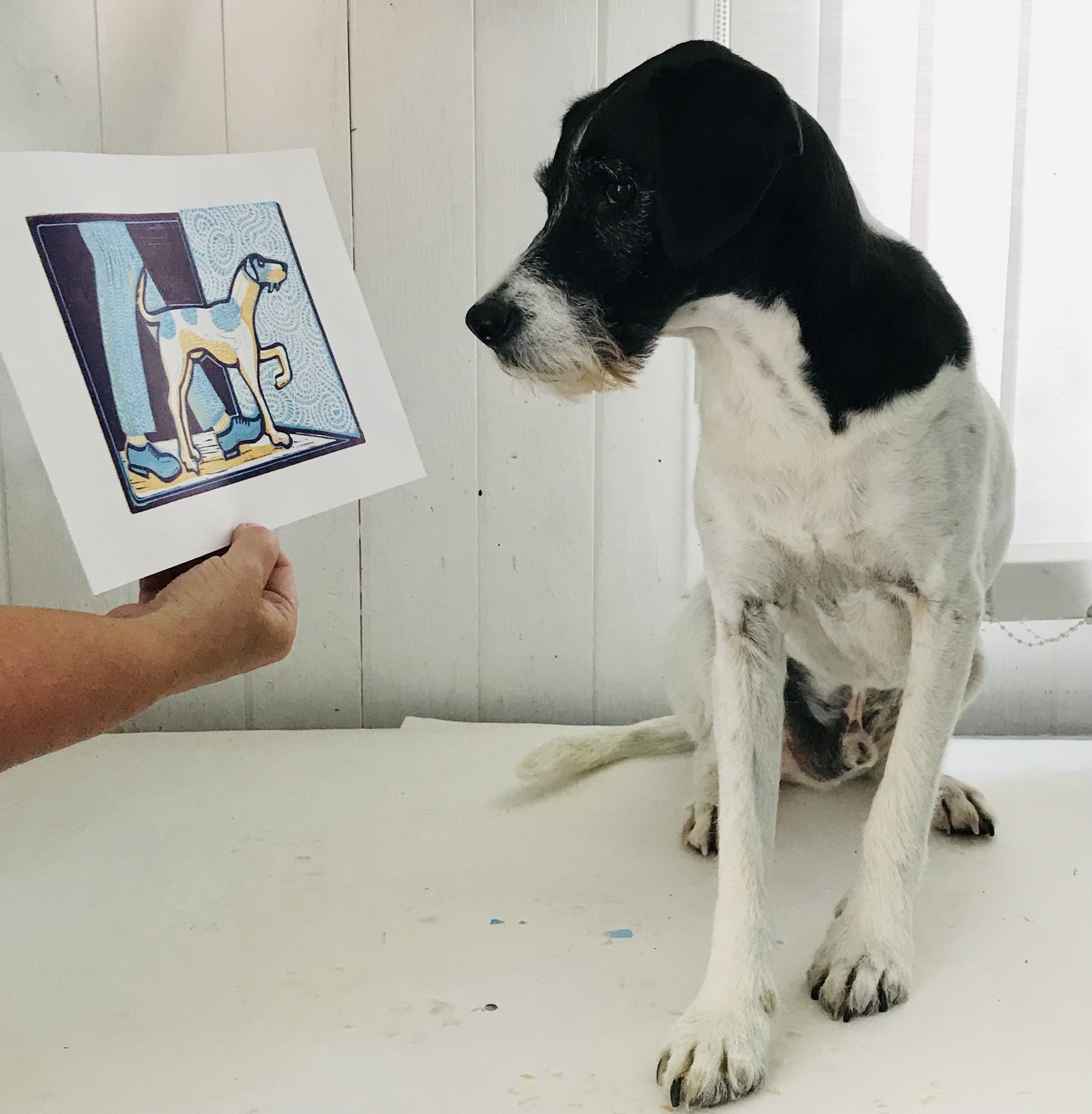
A linocut print of a dog and a person wearing orange shoes and tweed trousers, selected for the Atelier beside the Sea, Brighton Open 2023 and SFGA Mall Galleries 2024.
A humorous artwork about going out into the warm air.
‘Every week at work we had a bonus ball lottery and I won. With the winnings I bought a rescue dog from St. Francis Animal Welfare, Fair Oak called Bruce. When I retired from teaching I made this linocut print to celebrate moving on and as gifts for my colleagues. The artwork's colour and texture symbolise my mixed emotions about being on the threshold of leaving and Bruce is pointing the way out, it's simultaneously a happy and sad feeling.’
Royal Society of British Artists 2024
Event: The Royal British Society of Artists
Dates: Feb. 29, 2024 - March 9, 2024
Venue: Mall Galleries, London
Annual Exhibition
Artwork description
A detailed nighttime suburban landscape linocut print conceived during lockdown, it is one of my early linocuts from 2021. Our dog 'Bruce' never gets bored of walking our local streets day or night and neither do I, there is always something to catch the attention if you look closely. I had fun making the windows the highlights, and varying the marks for the sky, the roof’s and the foliage, all the wheel hubs and headlights were made by twiddling a fine drill bit.
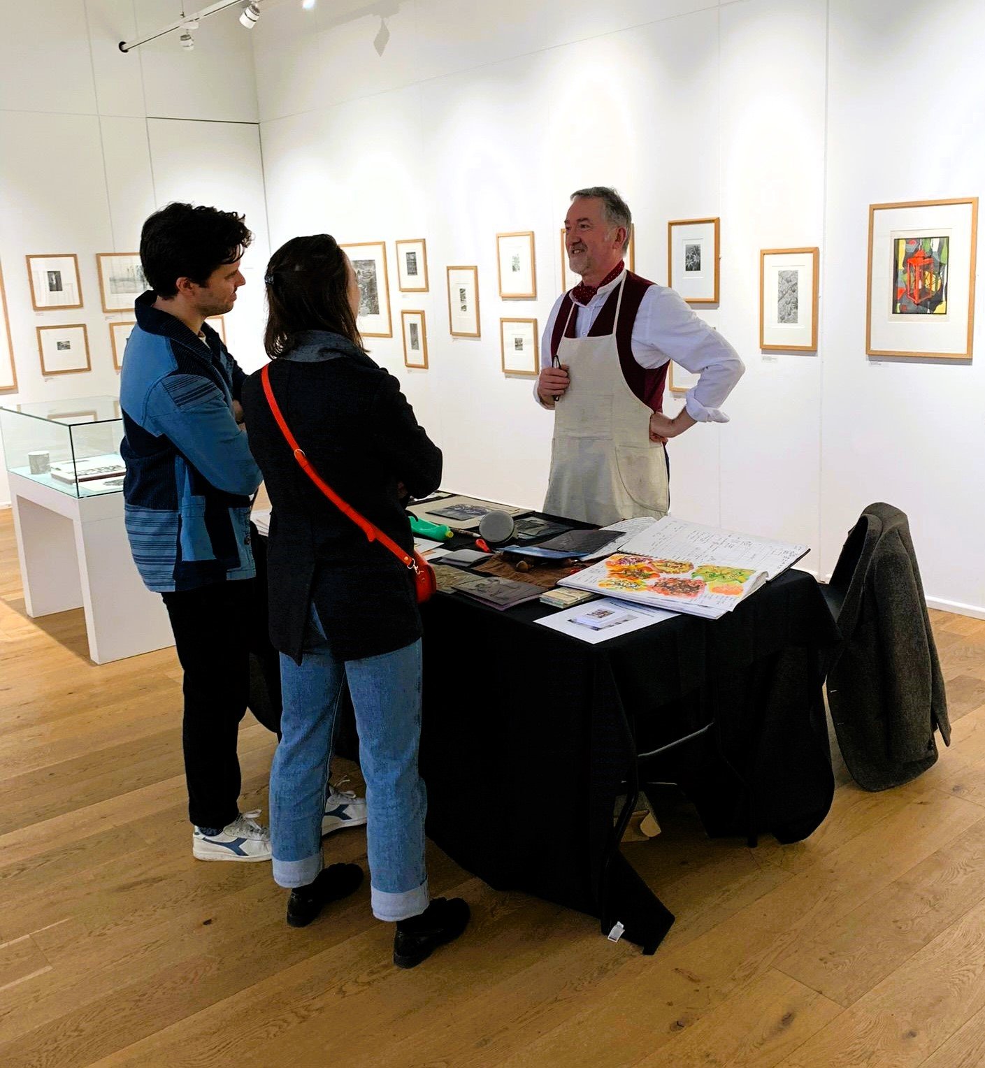
Linocut demonstration at Bankside Gallery
Bankside Gallery linocut demonstration
I like wearing the printmakers apron, it puts me in production mode! I spent more time talking with gallery goers than printmaking, and thats how it should be, I was there to answer questions and offer suggestions, visitors prefer not to disturb you if your busy cutting or printing.
Tools of the trade
I print with Caligo Safe Wash inks, often using extender to stretch the ink further and also to make the layers of colour more transparent and a small dab of wax drier to speed up the process. The powder in the pot is talc, which I use to blot out ink that I don’t want on the linocut block. The wooden handle is a large clay modelling tool, ideal for focussed burnishing on the back of the paper when printing.
Society of Wood Engravers 86th Annual Exhibition 2024
'Cut Loose' process
I have had lots of practice hand printing this image in a variety of colour combinations, and the design continues to evolve. Jo Morley of Omega Printmakers Portsmouth had suggested I needed some texture in the original design so I ended up cutting three blocks of lino. The swirling pattern whilst looking like wall paper is intended to represent a ‘blustery’ atmosphere, I’ve always admired Leonardo Da Vinci’s waterfall drawing and its influence is evident. Whilst cutting these blocks I never know how much ‘chatter’ to remove, as they provide printed evidence of the handmade process and can suggest movement if going in the right direction.
Bonus Ball Bruce
Some background information about Bruce and the artwork 'Cut Loose'.
Bruce was 6 months old when arrived at St Francis Animal Welfare in Christmas 2015/16. He's a black and white spaniel/terrier cross (6/6/2015), very lively and too much for his previous owner who wasn't well.
I took him for a walk during an open day in January 2016, returned him and waiting at the gate was young family who said 'mummy, mummy can we have that one'. On impulse I said 'sorry he's sold'. (I felt really awful to disappoint them), Vicky was rather surprised because in five years of volunteer walking I had never expressed an interest to buy.
I bought him with bonus ball winnings and told my art department colleagues at Peter Symonds College, Winchester I had invested their money in Bruce.
When I retired from teaching, I gave my colleagues 'Cut Loose' linocut prints as farewell gifts, inspired by the theme of moving on to pastures new with mixed emotions, both happy and sad. Every year I used take Symonds A level Art students to the Royal Academy Summer Exhibition and I have been submitting artwork without success until this year, when they accepted my 'Cut Loose' linocut print.
Box Frame experiments
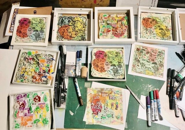
Mixed media. Linocut Chine Colle on Ordnance Survey maps (60's) with acrylic on glass in box frames. 21 x 21 x 2cm
I think the more successful of these experiments has less painting on glass, therefore not obscuring the background. I've echoed the map colours and tissue paper colour on the glass.
Chine colle printmaking
'Hounds of the Heath’ experiments with tissue paper and linocut prints on old ordinance survey maps. Image sizes 30 x 20 cm.
Chine Colle process
I carefully place overlapping colour tissue paper on the inked lino, and then spread rice glue on the paper using a brush, sometimes the tissue remains stuck to the inked lino when removing the map doh! so then you apply more glue and peel away the print from a different angle - works most of the time. Its most interesting when the paper is light toned, so that the map colours and detail still shows through, the more transparent the better. The maps are from the 60’s so I believe I don’t infringe copywright, however I think to be on the safe side, I will adapt and make my own.
Dog Walk Map
'Hounds of the Heath 2.' A two block limited edition linocut print showing dogs and their owners walking around the heath. Image size 30 x 20 cm.
My recent artwork has been reflecting on repetitive activities: I spend at least an hour each day walking with my dog and three years ago I thought I ought to 'capture' the time spent through drawing our routes and recording the incidents experienced.
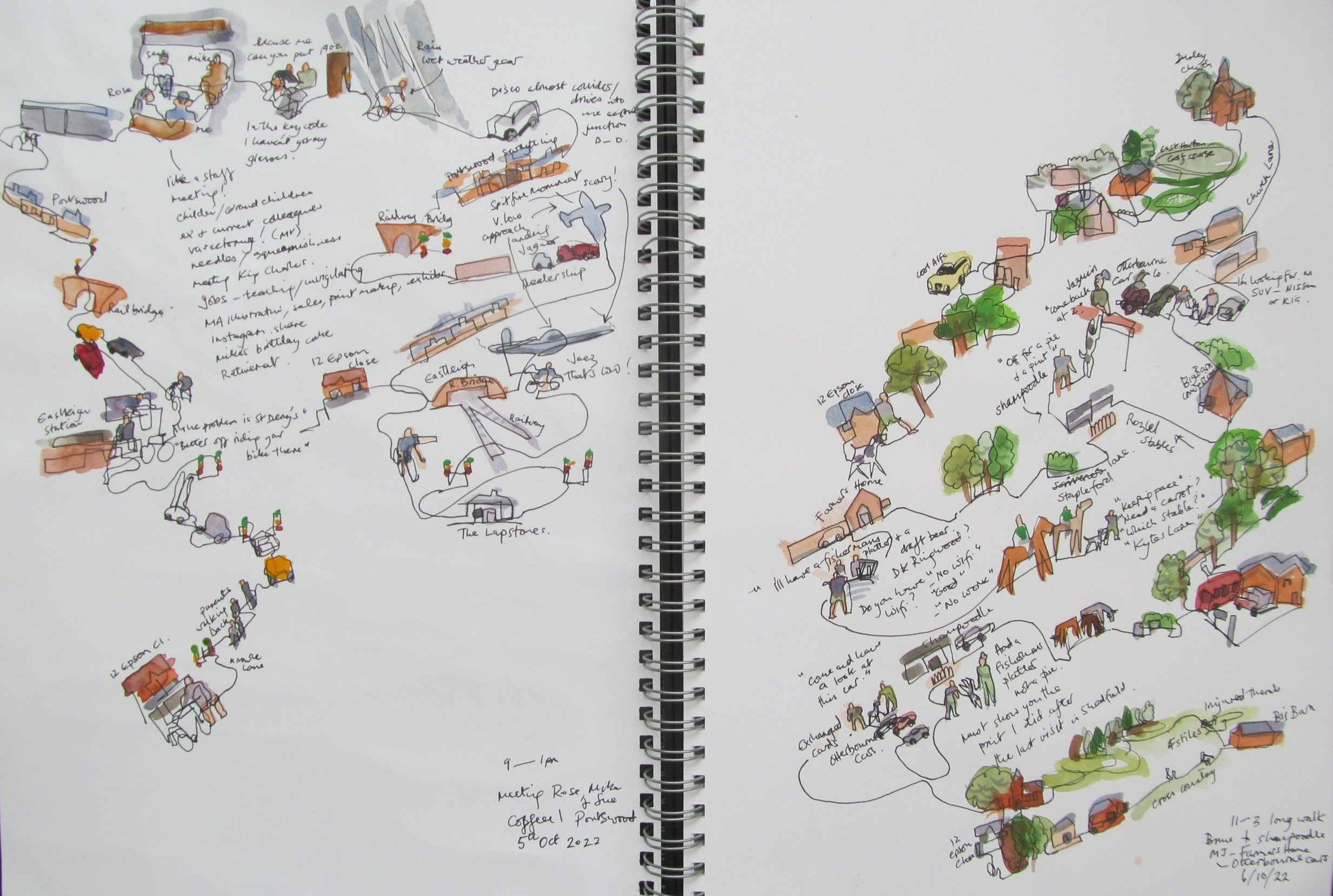
Memory drawings in A3 sketchpad.
I like to draw a continuous line in ink with my eyes closed, recalling the route and incidents from memory, colour and written notes are added to clarify details with my eyes open! The result may appear haphazard, but I like the element of surprise and spontaneity this method of drawing creates. Some of the more interesting drawings I convert into paintings or relief prints.
